Cream in motion
Ice-cream portfolio case study · 18 seconds
Inside the ice-cream film / 18 seconds / 5 references
The motion was planned.
The flavour was directed.
A Blender camera plan, five AI-generated stills and a written brief. Here’s how I brought them together for Cream in motion.
- 01
Choreograph in Blender
Seven shots define the camera, staging and main action. Simple colours identify the objects.
- 02
Direct with five images
Packaging, food texture and material details each get a specific reference.
- 03
Give every input a role
The brief connects each image to its shots and explains which decisions belong to the motion guide.
- 04
Generate and compare
Seedance 2.5 interprets the combined direction. Play the actual result beside the guide to inspect what carried through.
Independent portfolio concept. Placeholder branding. Shot times describe the Blender plan; the generated take can interpret motion and timing differently.
Motion guide720 × 1280
Authored in Blender
Simple materials. Camera, timing and action.
Seedance film480 × 854
Generated with Seedance 2.5
Generated from the motion guide and five appearance references.
Explore the seven shots
Seven shots
Press play to load the videos
Grazing macro arc across vanilla ridges
Shot cues follow the Blender plan. Timing in the generated film may vary.
The five inputs
Each image has a job.
Select a reference to see its role and a prompt excerpt.
Spoon lift · Runway · Overhead · Hero landing
The product identity
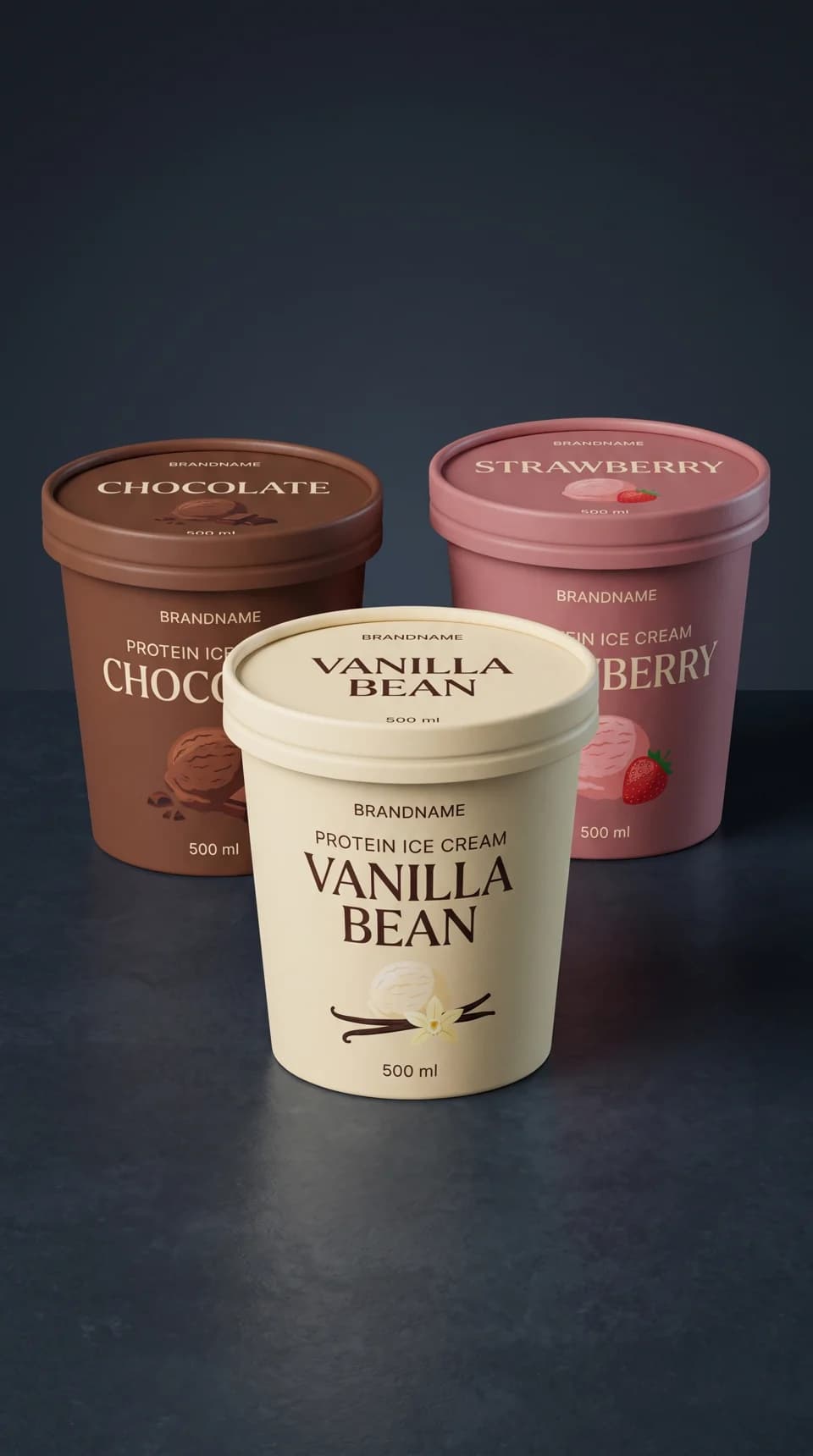
Ivory, cocoa and dusty rose. One packaging reference gives the three flavours a consistent family of labels and a matte paper finish.
How the brief scopes it
The Blender guide supplies the tub shapes and positions. The photograph supplies the artwork, mapped by flavour. The same image is reused wherever a tub appears.
This cues the planned shot and leaves playback paused for inspection.
From the direction brief
[Image1] = the single packaging reference, reused for packaging artwork and paper material whenever tubs are visible in any shot. There is no second packaging reference. Preserve the video tub shapes and staging; map artwork by flavour, not photograph position. Printed scoops stay printed on the label.
The prompt that joins them
Motion first.
Appearance by reference.
The five images are uploaded once, in the order above. [Video1] is the Blender motion guide. [Image1] is the same packaging reference in every shot that needs it.
The reference-priority rule
Reference priority: [Video1] determines the camera path, lens perspective, shot framing, object count, placement, scale, major trajectories and timing. Image references determine only the appearance or local material behaviour assigned below. They are not first-frame targets. Do not replace the moving shot with a pan or zoom over a still image. Render new viewpoints and coherent parallax as the camera travels.
Read the full 18-second direction brief
The consolidated brief prepared for this five-image setup. It asks for no generated audio; the supplied result includes audio. The displayed brief is the creative direction, not an export of the final API request settings.
SETTINGS: 18s · 9:16

Create a premium photorealistic ice-cream commercial in vertical 9:16. Use warm-ivory vanilla, rich cocoa-brown chocolate and natural muted-pink strawberry. Render dense frozen cream with fine scoop marks, tiny irregular air pockets and restrained moisture. Light with a broad neutral-warm key from upper left, a subtle cool rim and controlled deep shadows. Keep a dark charcoal-blue studio atmosphere and chilled dark stone wherever the guide shows a background or ground. Preserve readable food detail during camera motion. No hands, watermarks, additional overlays, unrequested props or packaging deformation.

Reference priority: [Video1] determines the camera path, lens perspective, shot framing, object count, placement, scale, major trajectories and timing. Image references determine only the appearance or local material behaviour assigned below. They are not first-frame targets. Do not replace the moving shot with a pan or zoom over a still image. Render new viewpoints and coherent parallax as the camera travels. Keep the guide's near/far relationships while refining fine food texture and local soft-cream deformation.

Create the full 18-second edit. Match all seven shots in [Video1], with six cuts at 2, 5, 7.5, 10, 12.5 and 15 seconds. Preserve the final one-second complete hold. Do not add transitions or cuts. Use the supplied images as scoped appearance references:

[Image1] = the single packaging reference, reused for packaging artwork and paper material whenever tubs are visible in any shot. There is no second packaging reference. Preserve the video tub shapes and staging; map artwork by flavour, not photograph position. Printed scoops stay printed on the label. Use this latest BRANDNAME packaging reference, with its ivory, cocoa-brown and dusty-rose artwork. Retain the video's dark setting, stepped supports and camera route.
[Image2] = vanilla macro texture, fine seeds, pores and soft ivory folds. Keep this warm-ivory vanilla consistent across scenes, allowing normal lighting variation.
[Image3] = spoon/cream appearance and local adhesion only. Its close crop must not remove the video tub. Its cream neck represents a brief stage of release, not a permanent tether.
[Image4] = ribbon thickness, satin finish, rounded edges and scoop texture only. The video determines the growing ribbon's number of turns, extent, timing and occlusions; the completed still must not replace the opening pose.
[Image5] = three scoop colours/textures and ingredient materials. For the floating scene use the video ingredient sizes, counts and paths. For the overhead use only the flavour textures on the fillings already inside the tubs; do not introduce floating scoops or fruit there.

0–2 seconds: 35-degree continuous macro arc across vanilla ridges. Broad geometry and travel come from the video, fine material from [Image2]. Keep the moving focal region legible.
2–5 seconds: one spoon lifts one vanilla scoop from one open vanilla tub. Use [Image1] for the tub packaging and [Image3] for spoon/cream appearance. Locally reconstruct adhesion and the contact groove. A short cream neck beside the spoon edge thins, separates and recoils by approximately 3.8–4.0 seconds in the full edit. Permit earlier local separation if needed to prevent a long rubbery string. Preserve the main scoop/spoon lift and camera path; hold the supported scoop near the end.
5–7.5 seconds: one ribbon curls around one suspended vanilla scoop during an ascending 92-degree camera orbit and small bank. Follow the guide's evolving envelope, with viscous local deformation and soft tapering. Do not add spiral turns from [Image4].
7.5–10 seconds: a 115-degree bullet-time orbit around exactly three flavour scoops and the guide's tumbling ingredients. Maintain flavour identity, independent trajectories, correct ingredient scale and coherent depth.
10–12.5 seconds: constant-rate 300 mm lateral track past planted closed vanilla, chocolate and strawberry tubs in that order. Packaging comes from [Image1]. Tubs stay fixed while the camera travels.
12.5–15 seconds: overhead descent of 290 mm and optical-axis roll of 35 degrees over three open tubs. Reuse [Image1] for packaging and [Image5] only for the flavour textures of the fillings. Their cream remains seated within the rims. No lids or detached scoops appear. Ease into the short hold.
15–18 seconds: staggered lid/tub landing on stepped dark stone, camera pullback and rise. Reuse the same [Image1] for all three tubs and their printed lids. Vanilla stays front and low, chocolate behind left, strawberry behind right and highest. Everything is completely still for the final second.

Fit the reference's flavour-specific packaging artwork and matte paper finish to the tub geometry in [Video1]: 100 mm top diameter, 88 mm base, 78 mm height. The guide determines tub proportions; fit the reference artwork to those surfaces without stretching the tub geometry. Map artwork by flavour, independently of the left/centre/right positions in the photo. Preserve visible label design and flavour lettering where legible; do not invent extra text or claims. Keep the dark film lighting and the guide's staging. Use the reference's BRANDNAME placeholder and existing flavour artwork; do not invent another brand. Printed food illustrations remain printed on the labels. Keep lids open or closed exactly as specified by the shot.

Interpret guide colours as object IDs, not final colours: orange tub = vanilla pack, blue tub = chocolate pack, green tub = strawberry pack; yellow cream/flecks = vanilla; purple scoop/cuboids = chocolate cream/chocolate pieces; pink scoop/fruit forms = strawberry cream/whole strawberries; cyan = stainless spoon; pale lilac ribbon = vanilla cream; grey = dark stone and plinths. Shape distinguishes scoop and ingredient components within a flavour family.

Generate exactly 18 seconds, vertical 9:16. No generated audio required.